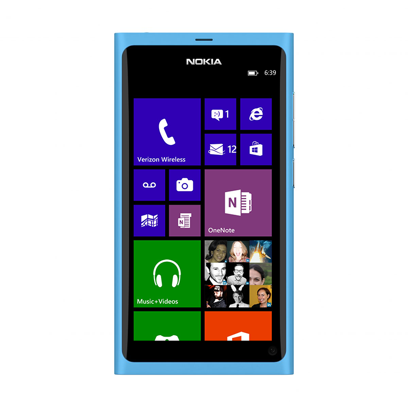
Apollo
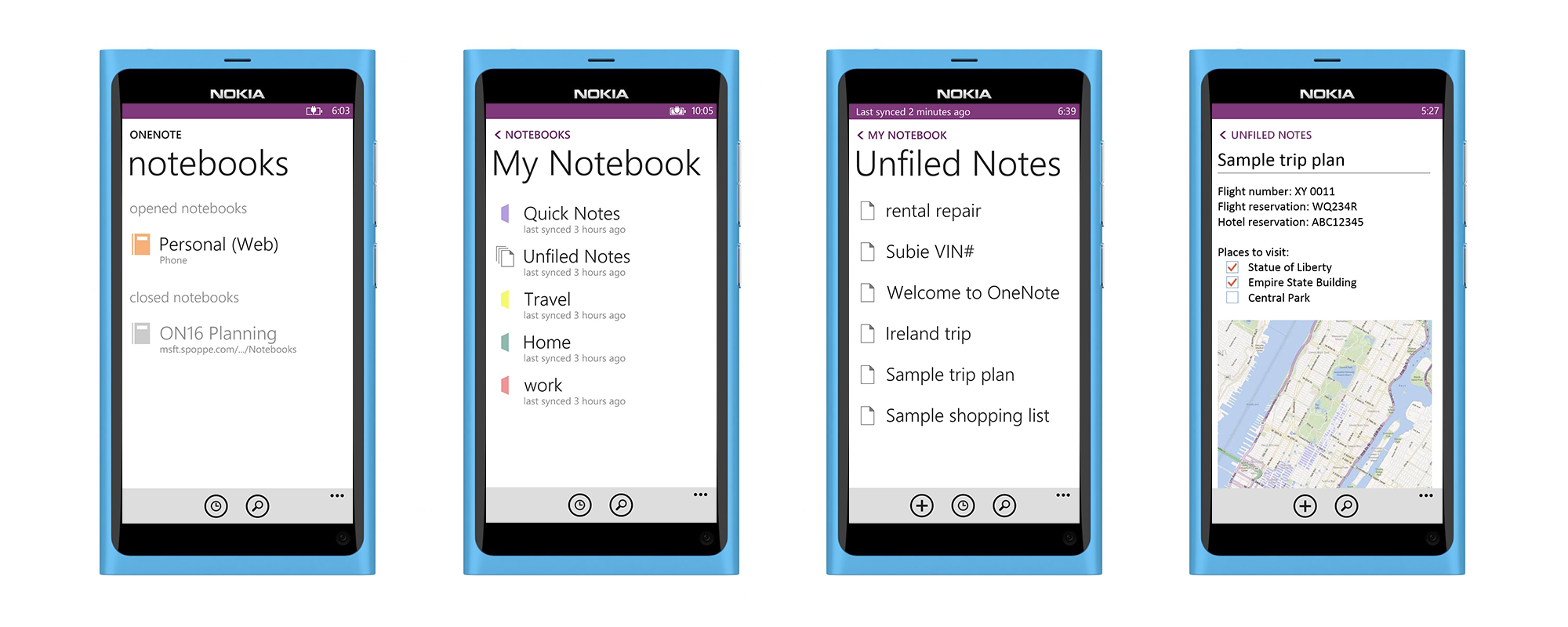
ONENOTE APOLLO
Apollo, the first major update cycle for Windows Phone. This time around OneNote became its own app, separated from the Office Hub experience, and in turn, released from some serious usability problems and feature constraints.
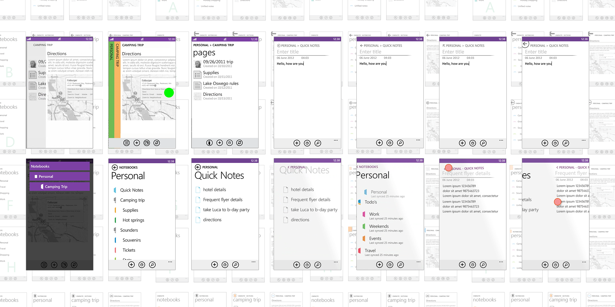
NAVIGATION
Navigation was a theme for this release. I spent an entire year (keep in mind this is Microsoft politics at play) with research iterating on alternative concepts to the platforms inadequate back stack pattern. In reality, it only took design and research a matter of a month to conclude on the best design model. However, OneNote was the first app on Windows Phone to require a hierarchical navigation model. This seemed to blow minds...
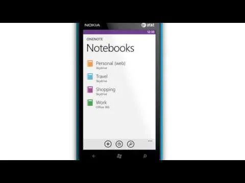
Swipe Concept A
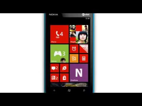
Swipe. An intuitive model unanimously supported by user testing. The motion and touch interaction in this example is subtle with a threshold point needing to be met before transitioning between nav levels.
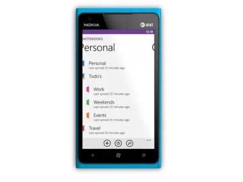
Swipe Concept B
The note canvas in this example doesn't pull in the upper nav content until the threshold point is met and released.
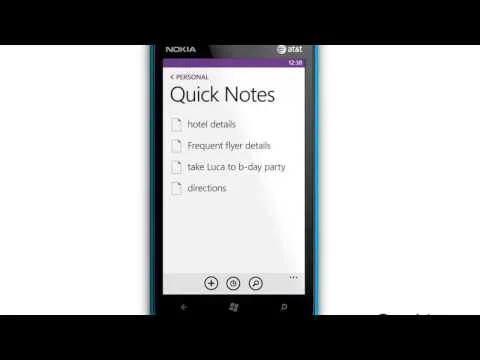
Tap Concept A
Tapping the breadcrumb navigates up the hierarchy chain.
Tap Concept Final
The end solution. This iteration uses "continuim" animation applied to the navigation constructs, title and list item, to reinforce traversing up or down the hierarchy. We didn't get the swipe behavior for this release, But after numerous 3rd party apps implemented there own versions of swipe the platform gave in. Another gated win.
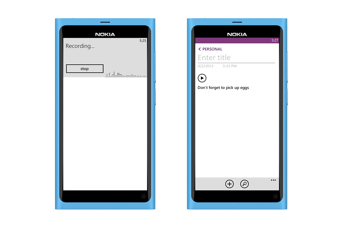
AUDIO NOTES
With no sign of Cortana on the horizon OneNOtes audio recording and transcription was a platform star. Launch OneNote, tap on the audio note command and start talking.
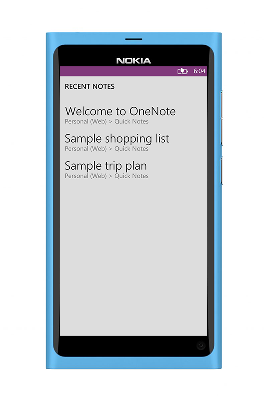
RECENT NOTES
Recent notes was a major shift and improvement to the OneNote organization model. Prior to this, users had no other way to see the most recently accessed or created notes. Design and research pushed to have the recent list as a 'place' in the hierarchy, parallel to Notebooks. The product team pushed back and we ended up with a transient view accessed from the app bar (the grey BG reflects this interaction pattern). In short time, the success of recent notes would make its way into every OneNote app experience as a primary navigation construct.
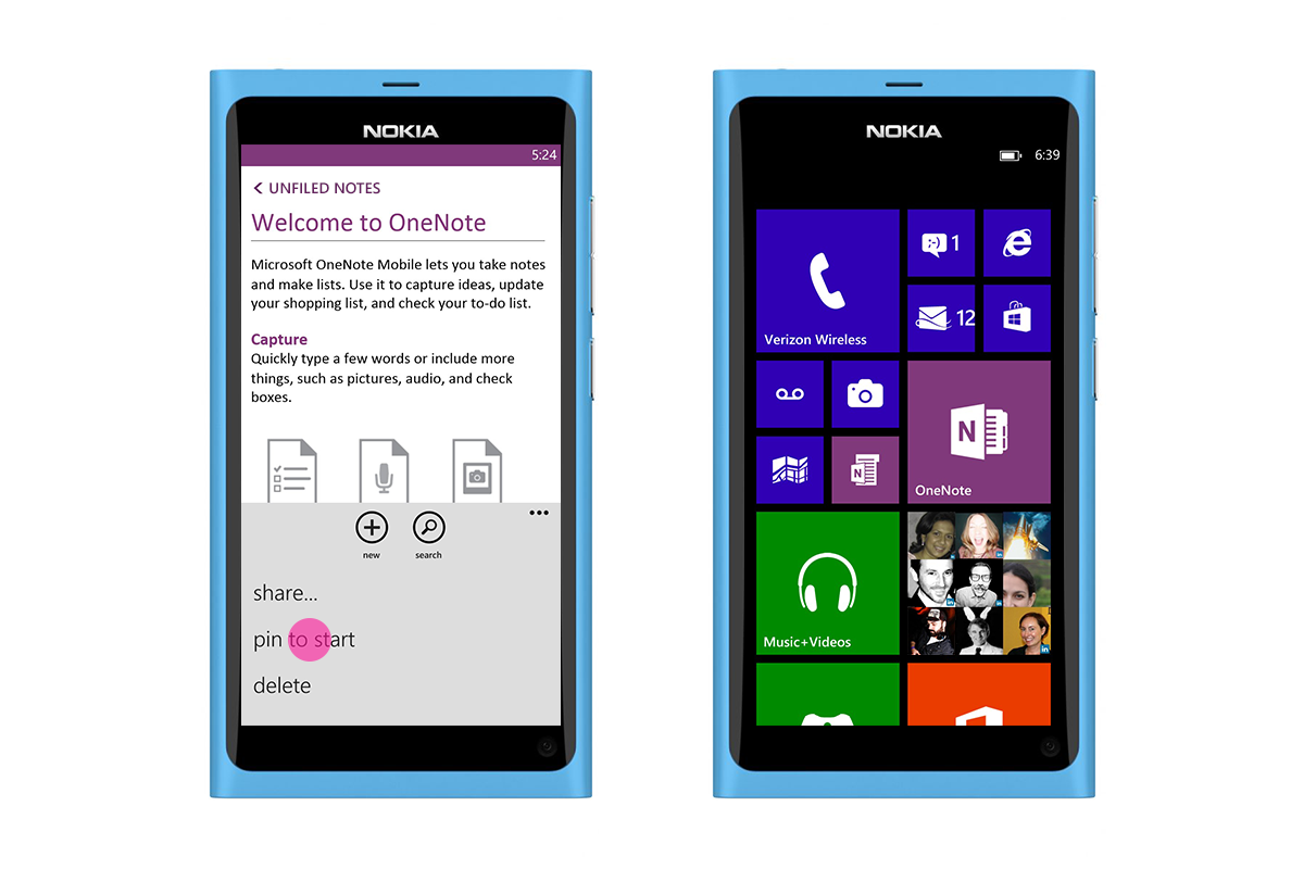
PINNED NOTES
A quick and easy method of recalling and accessing a note.
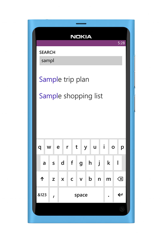
NOTE SEARCH
A quick way to bypass the navigation stack. Search your entire note repo from almost every screen in the app.
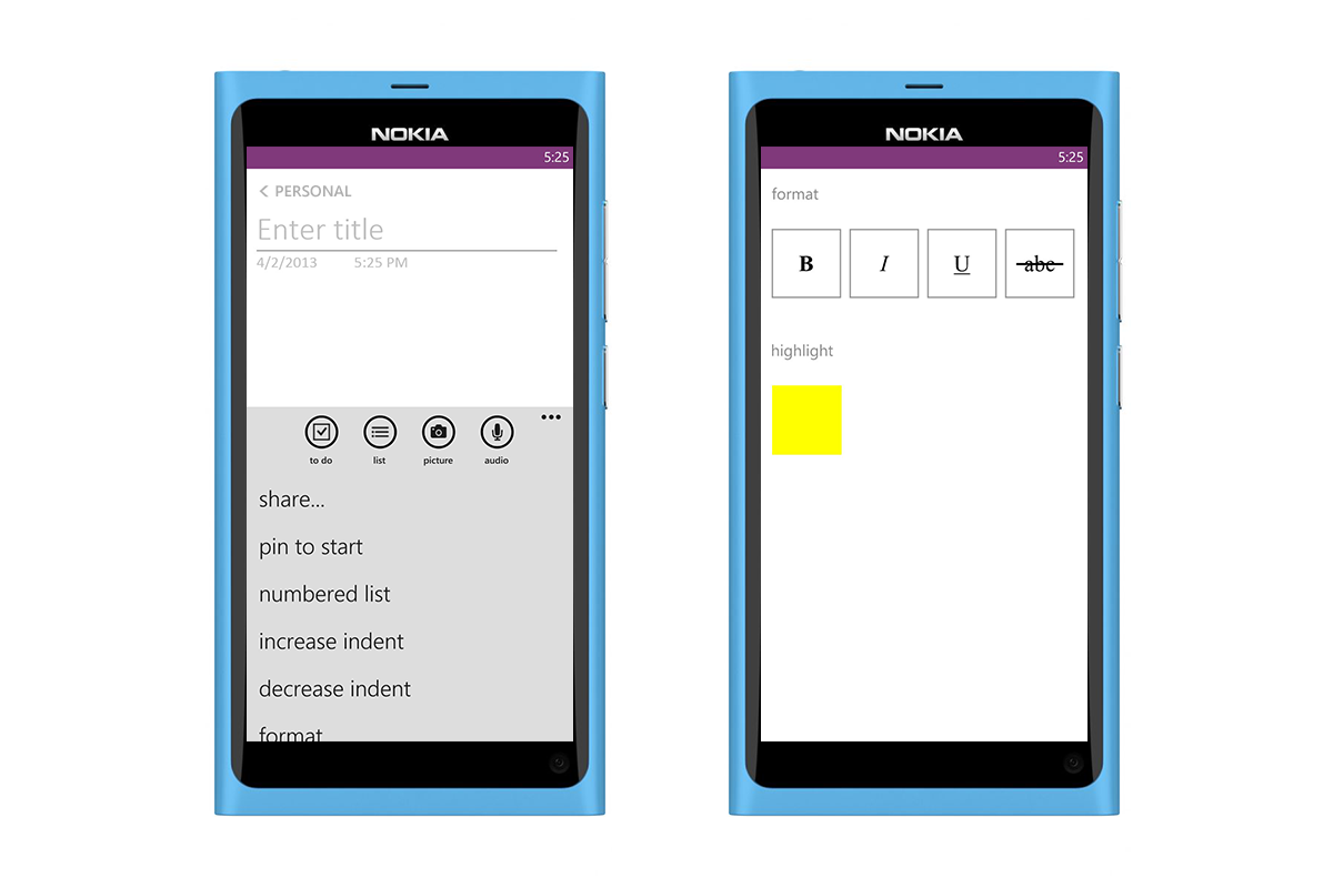
FORMATTING
Improved set of formatting functionality. This was one of many compromised solutions. The platform had not yet created an in-context/proximal control and it unfortunately fell into the set of backlog UI items for the next major update. A modal solution was the only viable option for this release.
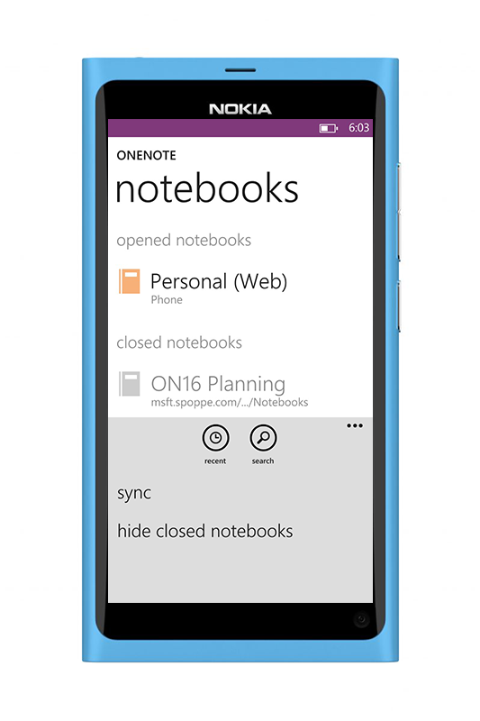
HIDE NOTEBOOKS
A power user could easily be over whelmed with all of there notebooks syncing down to their device, not too mention the storage space this might take up. The ability to hide notes was another one of our mobile first optimizations.