UNITY 2019.3 - EVOLVING THE UNITY EDITOR UX
How the advent of a new design signifies the first step towards improving the user experience for an increasingly complex and evolving content creation tool: The Unity Editor.
Millions of creators use Unity every day to make amazing content and interactive experiences. Over the years it has steadily evolved and grown in size to become the world’s leading real-time creation platform with a diverse and expanding audience of passionate users. As a productivity tool that’s used frequently and for long periods of time, ease of use and efficiency are everything.
With that in mind, the time had come to take a step back and look at opportunities for making improvements that are less about new features, and more about the look and feel, interactions, and workflows. We worked on design improvements in numerous areas to evolve the Unity Editor UX, many of which are reflected in the latest beta release. This continues to be a long term effort which will be released in multiple phases and is driven by the following goals:
Modern. We want to provide Unity users with a modern and professional Editor experience that feels inspiring, well-crafted, and trustworthy.
Familiar. The Unity user interface should be consistent and aligned with industry standards.
Accessible. The Unity user interface should be accessible to a wider range of users and their abilities.
Efficient. We want to enable users to create content and complete tasks efficiently by offering a clear and optimized UI for common tasks, as well as streamlined workflows.
A MODERN LOOK AND FEEL
We believed that good design is a harmony of form, function, and aesthetics. A product’s visual design should be purposeful and in service of usability and workflows. While the Editor UI lives under the Unity name, it’s become quite different visually over the years. As the ecosystem grew, we felt it was time to implement a consistent look and feel across the Unity Editor to increase visual quality and provide a more cohesive experience.
The Light and Dark themes have been updated with new colors and treatments throughout the UI to increase clarity. We’ve introduced a more lightweight and minimal look and feel to allow users to focus on their content and workflow. For example, we’ve removed gradients from the UI to reduce distractions while addressing user feedback to maintain a sense of depth in the UI which ensures that controls are visually distinct and convey their behavior and functionality.
Custom title bar and main menu bar styling. In previous versions of Unity, the Editor app title and main menu had a white background on Windows by default. This resulted in a visual disconnect between the top area and the rest of the Editor UI, most noticeably in the Dark theme. In order to provide a more seamless appearance for the top area of the Editor, we’ve applied a custom color behind the app title and main menu to match the new themes and harmonize the overall look and feel.
Icons are an essential part of the Unity Editor UI, visually expressing objects, actions, and concepts. They add many benefits such as preserving screen real estate, communicating meaning at a glance, accelerating the understanding of the UI, and enhancing aesthetic appeal. As part of evolving the Unity Editor UX, we felt it was time to refresh our icons and introduce a new unified style that’s not only consistent across the entire Editor, but also aligned with the icon style now found in the Hub, Services Dashboard, and other Unity web properties. These new icons are an expression of our visual identity and serve as one of the many common design elements that we’re beginning to apply across our products and services. Each icon has been created in multiple sizes to enable optimal rendering across display types (e.g. HDPI) and resolutions, ensuring that they always appear crisp and sharp on every screen.
NEW EDITOR AND HUB APP ICONS
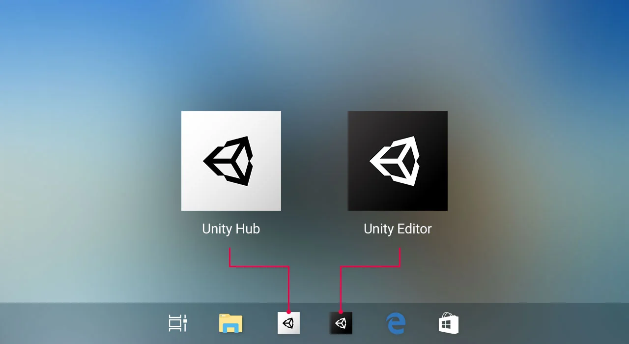
Icons which appear in the Windows taskbar and the MacOS dock serve as the front door to the apps which are launched when clicked. We wanted to create a new app icon for the Unity Editor that harmonizes with the new look and feel of the UI, bringing a fresh and consistent aesthetic to our ecosystem and the Unity experience. These aesthetics carry over to the recently launched Unity Hub which features a modern rendition version of the signature Unity cube against a white background as its app icon. Creating a fresh visual style and design language has been an integral part of refining our brand presence, and these changes to the Editor and Hub app icons reflect Unity’s continued evolution and attention to alignment.
NEW UI FONT - INTER
Text plays an important role in any user interface, and in one as information-dense as the Unity Editor, UI text is a crucial element in the experience. Proper legibility is essential. Getting text to display with consistent quality and reliability across multiple platforms is a challenge, as each operating system will render the same font differently. The Unity Editor has used the same fonts for a long time but they have often had multiple quality and rendering issues, so we wanted to introduce a new font which improves legibility and complements the look and feel of the new UI. We looked at a multitude of options and, after careful consideration for legibility and usability, we decided to go with the Inter font; a modern typeface designed for computer screens. It’s highly legible and helps minimize eye fatigue. Additionally, it renders well across all operating systems and screen types, e.g. both low and high DPI.
From an accessibility standpoint, we made some improvements to UI text as well: Previously, the text size in dropdowns and text fields was extremely small and problematic for many users, so we increased the minimum text size to make the UI more inclusive and usable for a wider audience.
REVAMPED CORE INTERACTIONS AND CONTROLS
The Unity Editor has many core interactions (also known as “micro interactions”) and controls that are used frequently across many workflows. Improving them can therefore have a broad impact on efficiency and ease of use. That’s why we committed to addressing existing core interaction problems as well as improving the quality of controls both near-term and long-term.
Window focus. The Unity Editor is a dense environment where many different windows are open and in-use at the same time, making it difficult to keep track of which window is currently in focus; that’s why we introduced a visual indicator, a blue line, to clearly indicate which window is currently in focus and receiving input from the user. Our intent is to bring a stronger sense of context to help users focus and stay in their flow.
Tab improvements. In the past, the width of tabs was fixed so that they were always the same size in the UI, creating a visually unbalanced layout of tabs where the space between unselected tabs was inconsistent due to the varying text length. Now the width of tabs is based on the text inside, meaning that the spacing between them is always the same. The flexible width also helps with localization as translated text strings can vary greatly in length across languages.
Adding new content. Adding content is a key interaction in all creation software: The “+” button has become a signature element in modern UI which users look for when starting their creation workflow. We’ve adopted this element in the Editor to preserve space and provide a familiar and consistent experience for creators.


